A hundred and thirteen React galleries, one typeface, eight photographs, no colour.
Four Wix custom-element packs held 113 gallery, carousel and slideshow components as raw JSX. Every colour in them was flattened to a 16-step grey ramp, every typeface set in Neue Haas Grotesk and every photograph replaced by one of eight. Each was then compiled with Babel, mounted against React 18.3.1 and captured. This page follows Bento Grid Gallery, from the pack JSON to its 12.1 KB of source.
Open the live library ↗
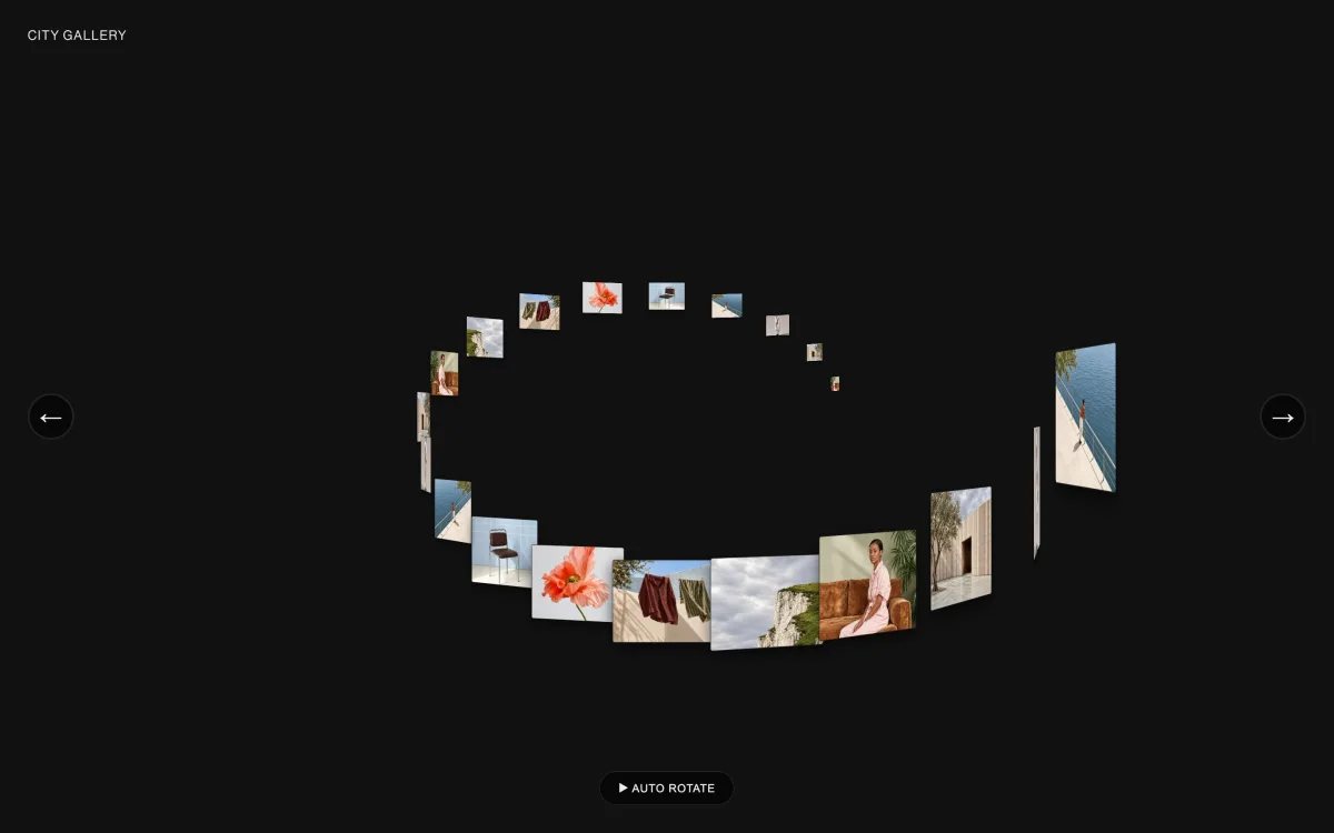

- Components
- 113
- Families
- 21 (Gallery 51, Media 13)
- Editable props
- 1,716
- Headless run
- 107 clean · 6 flagged · 0 failed
- Source
- 1.72 MB JSX
Flatten
Three rules, applied to every file in the library by one script. Nothing was redesigned by hand.
One typeface, eight pictures, no hue
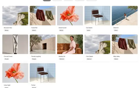
The packs arrived with their own palettes, their own system font stacks and 61 different stock photographs. All of it was rewritten in place: 226 component files, their prop schemas and the library UI around them.
- Colour
- Every hex, rgb and hsl value converted to its luminance and snapped to a 16-step grey ramp. 473 colour props among them.
- Type
- Every font stack replaced with Neue Haas Grotesk Display Pro, falling back to Helvetica Neue and then Arial. Enum values like “mono” left alone.
- Image
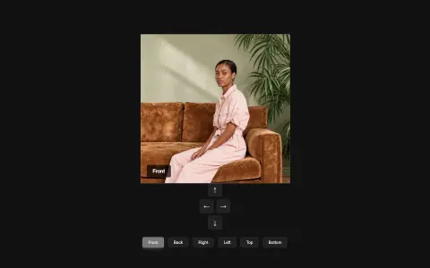
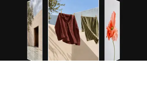
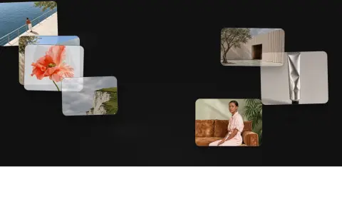
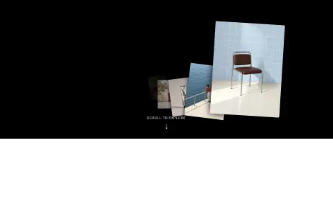
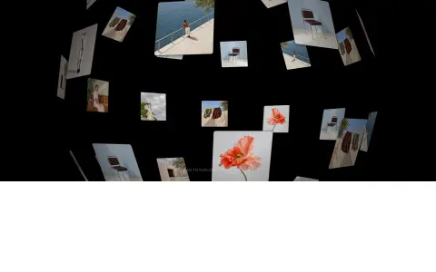
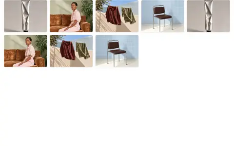
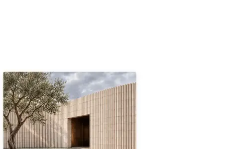
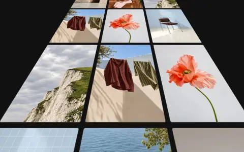
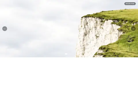
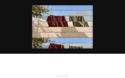
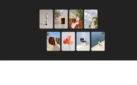
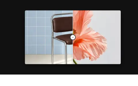
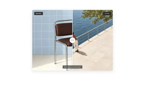
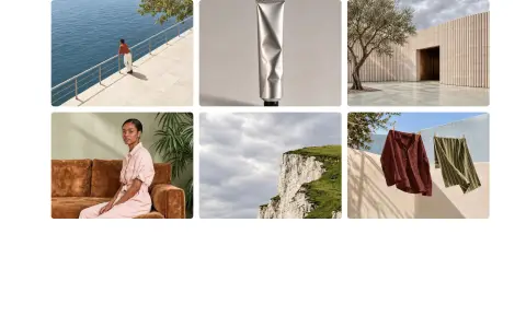
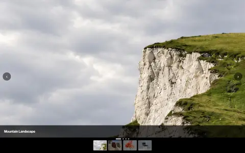
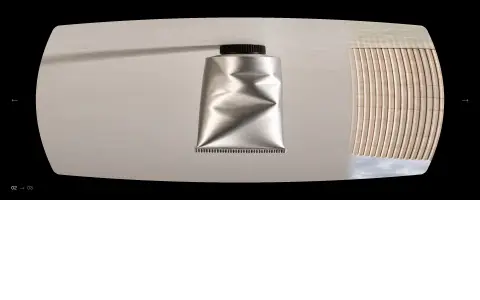
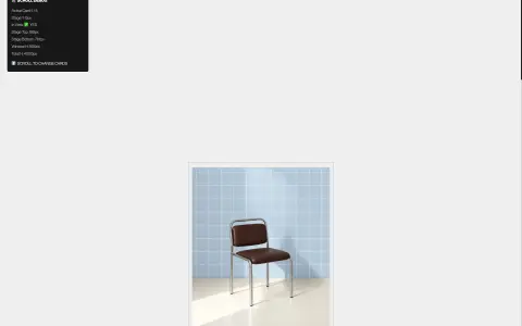
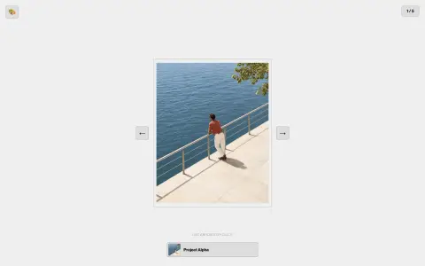
- Every remote photograph replaced by one of eight local files, cycling from a per-component offset so no two neighbours open on the same picture.
Run
Nothing is listed on trust. Each restyled component is transformed, mounted and watched until it settles, and whatever the console says is recorded next to it.
Seven stages, 113 times
The runner walks the four pack files, pulls each component's restyled JSX, compiles it in the browser and mounts it into a blank iframe holding React 18.3.1 and nothing else. Median render was 907 ms; the slowest, Z-Stack Gallery, took 1,020 ms.
- 01Read pack JSON
- 02Extract and restyle
- 03Babel transform
- 04Mount in iframe
- 05Settle 2.2 s
- 06Capture frame
- 07Record result
From pack file to shelf
Four inputs, one restyle pass, 113 live previews and three artefacts: a measured result per component, a 1440 px frame, and the JSX you can read in the panel.
Packs
Extract
1,716 props
Restyle
8 photographs
Mount · React 18.3.1
113 iframes, four at a time
Recorded
01 / 05The shelf
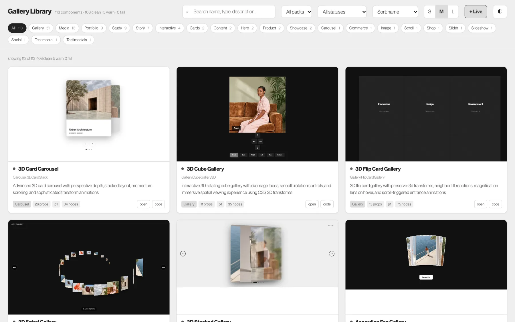
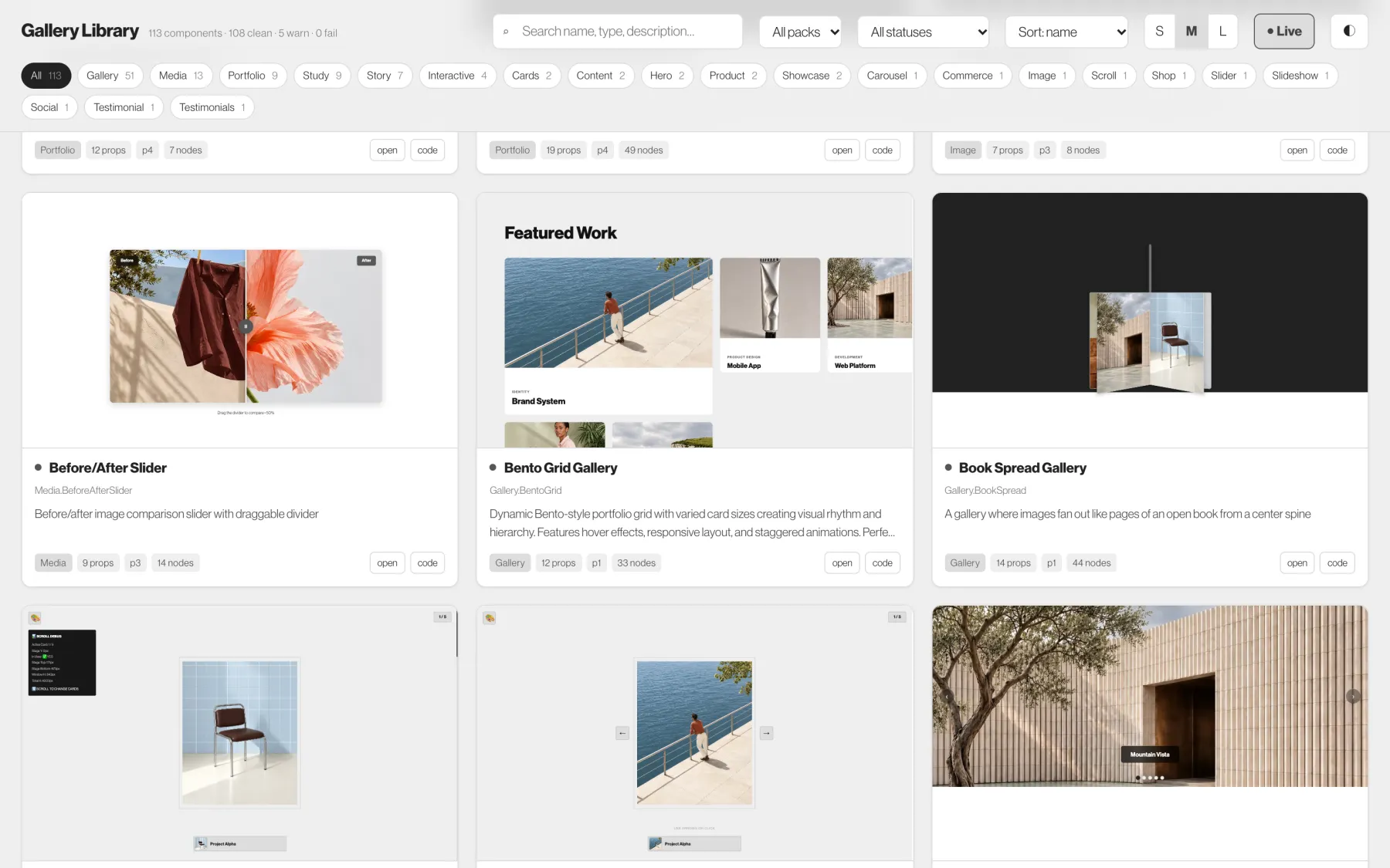
113 components, mounted as you scroll
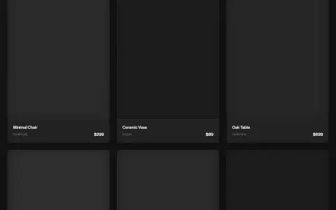
The library opens on every component at once. Each card shows its captured frame straight away, then mounts the real component over it as the card nears the viewport, so the grid you scroll is running code and never a blank box.
The header counts what survived the run: 107 clean, 6 flagged, 0 failed. Family chips below it carry their own counts, from Gallery at 51 down to the single Scroll and Slider entries.
02 / 05Narrowing
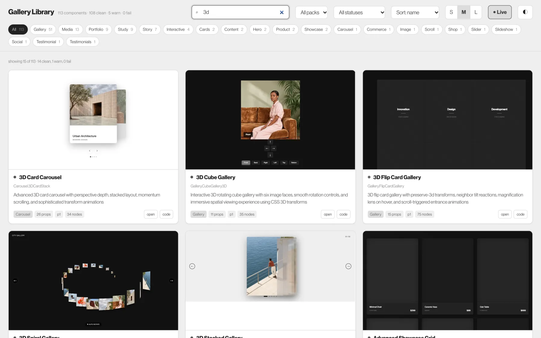
Type “3d” and 15 of 113 remain
Search runs over name, type and description together, so “3d” reaches 3D Card Carousel, 3D Cube Gallery and the spiral and tunnel variants in one pass. The count line updates with how many are clean, noisy or failed inside the current filter.
Packs, status and sort sit next to the search field. Families stay as chips so you can go straight to the 13 Media or 9 Portfolio components without typing.
Inspect
Open one and the preview takes the stage, with everything the runner measured and the source it was built from beside it.
03 / 05Detail
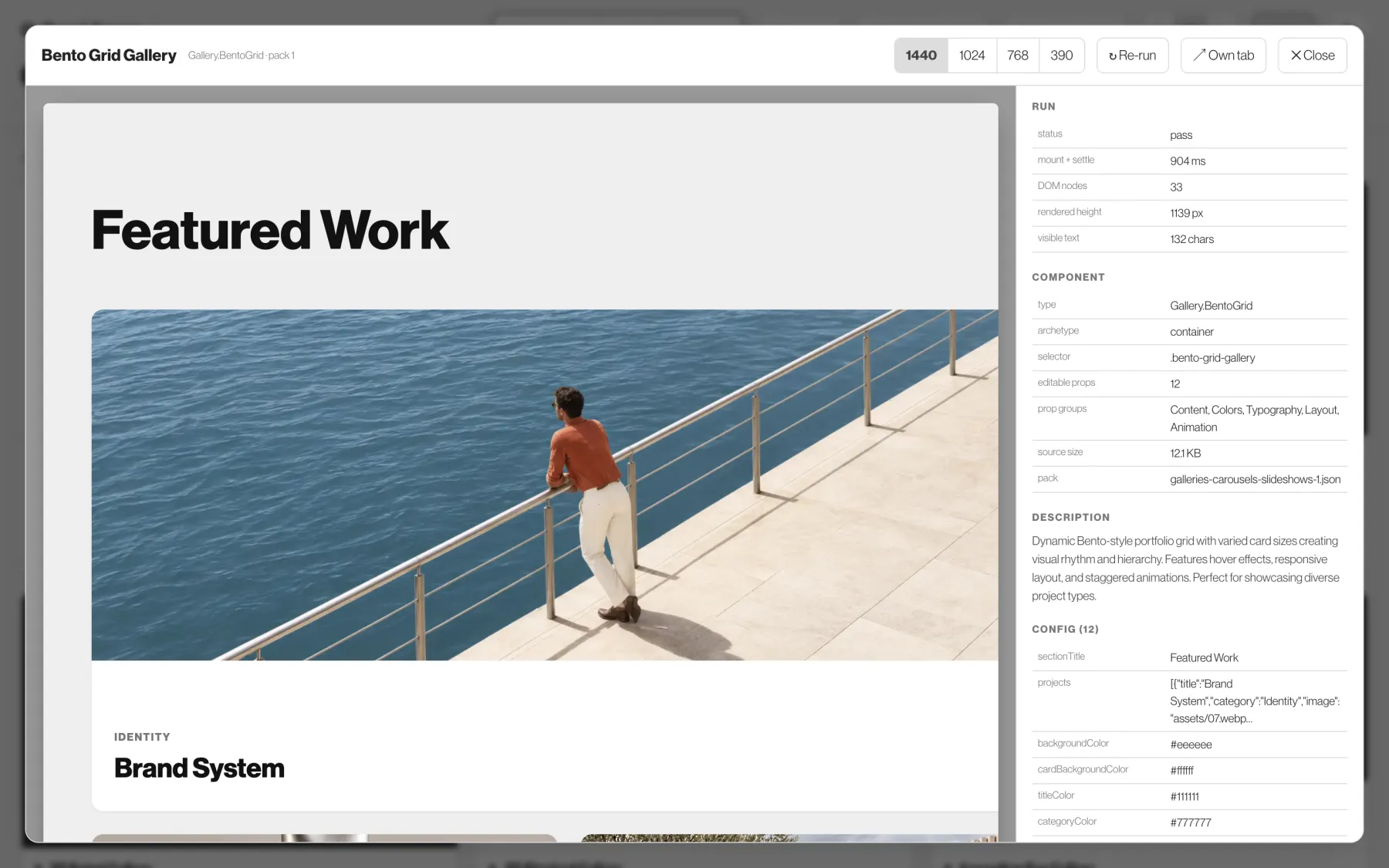
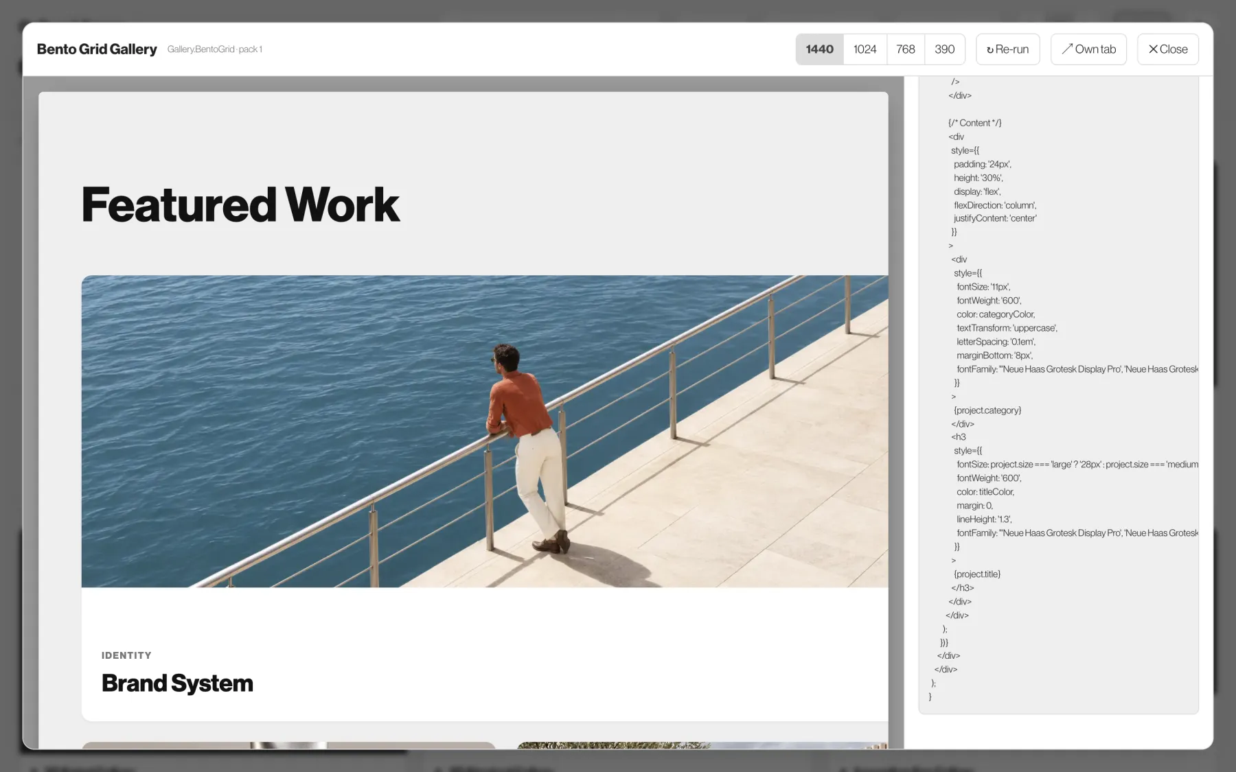
Bento Grid Gallery, 904 ms, 33 nodes
The detail view mounts the component at full width and lists what the run recorded: status, mount and settle time, DOM nodes, rendered height, visible text. For this one that is 904 ms, 33 nodes and 1,139 px tall.
Below it sits the component's own contract: 12 editable props across Content, Colors, Typography, Layout and Animation, with the defaults the preview is running on.
04 / 05Source
The JSX that produced the frame
One button swaps the panel for the component's source, the same 12.1 KB the runner compiled. Across the library that is 1.72 MB of JSX, held as plain text files next to the index.
Four viewport buttons re-run the preview at 1440, 1024, 768 and 390 px, which is how the responsive claims in each description get checked.
05 / 05What the run recorded
Every number on this page came out of the run
The library ships with its own result file. It is the reason the status chips can be trusted, and the reason six components carry a warning instead of a clean badge.
- 107 cleanMounted, settled and finished with an empty console.
- 5 noisymasonrygallery ×12 · flipcardgallery · imagegallerylightbox · logocarouselinfinite · polaroidphotogrid
- 1 blankgsapcontinuousslideshow — 105 nodes, section held at opacity 0 by an entrance timeline that wants GSAP
- 0 failedNo component threw during compile or mount.
- 103.3 s of rendermedian 907 ms · max 1,020 ms · 3,866 DOM nodes
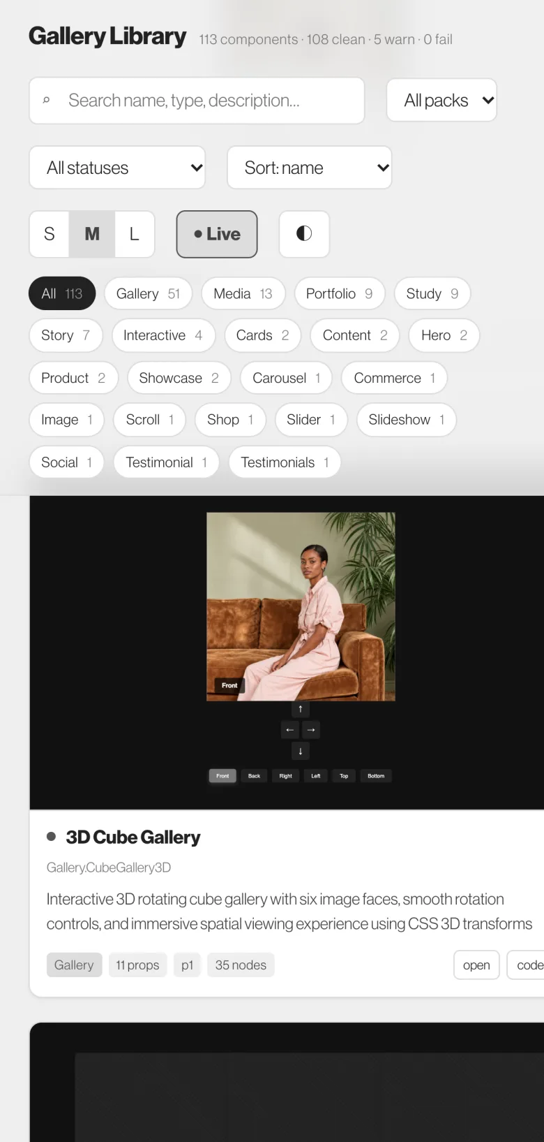
One column under 900 px
The grid collapses to a single column and the facet chips wrap, so the shelf stays scrollable on a phone.
Previews still live
Cards mount the same iframe on mobile. The Live toggle turns mounting off when you only want to read the catalogue.
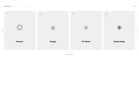
390 px preview
The detail view's narrowest viewport button matches this width, so a component can be checked at phone size without leaving the desk.
Dark by default
The library follows the system theme and keeps a manual toggle in the header.
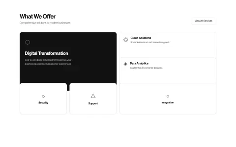
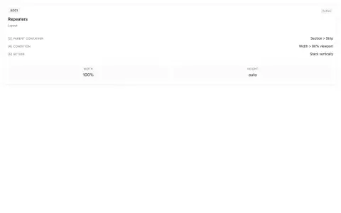
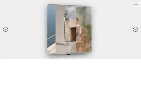
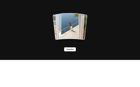
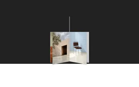
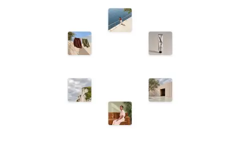
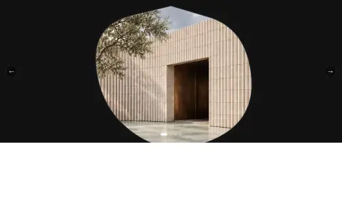
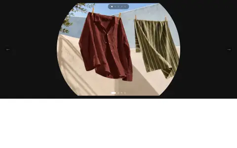
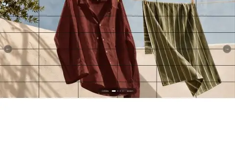
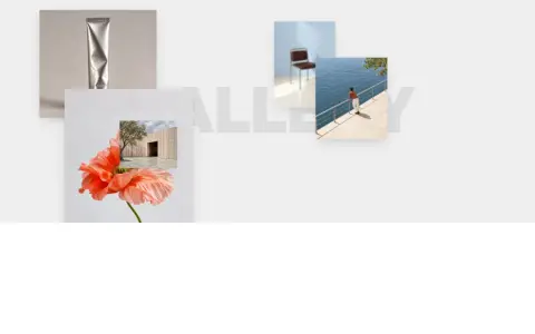
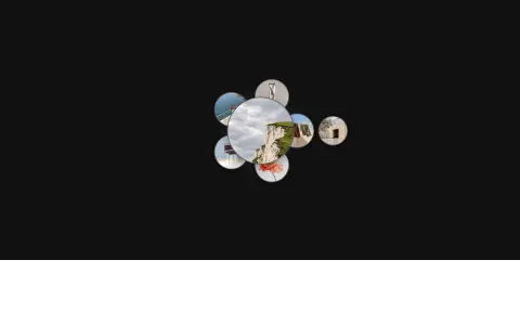
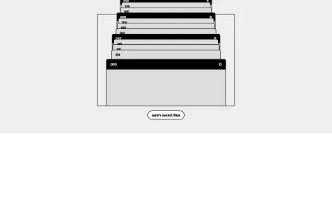
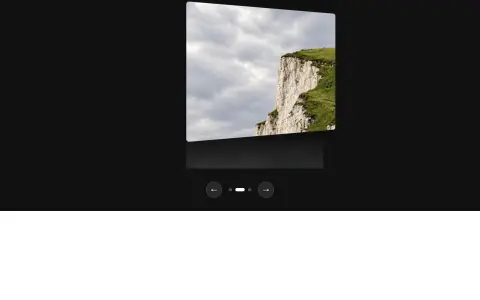
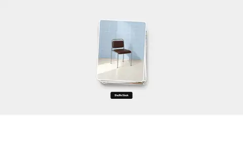
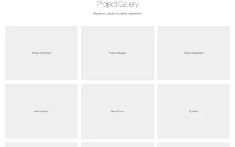
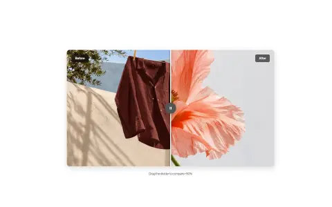
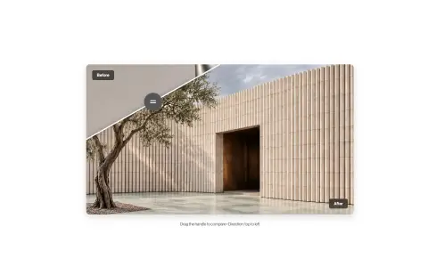
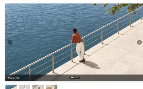
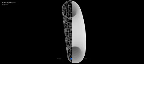
Every frame below came out of the same headless run: mounted in a blank iframe, scrolled once to trigger reveal animations, returned to the top, then captured. No component was listed from its description alone.








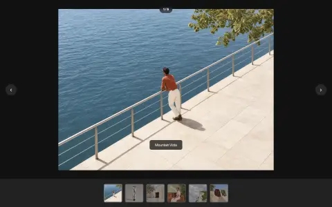
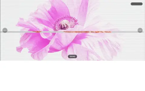
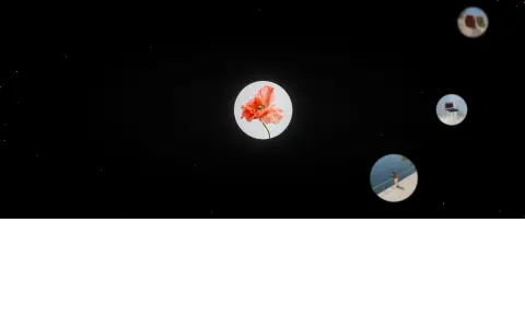




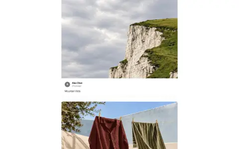
























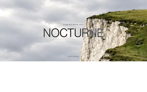
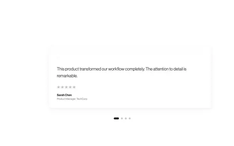
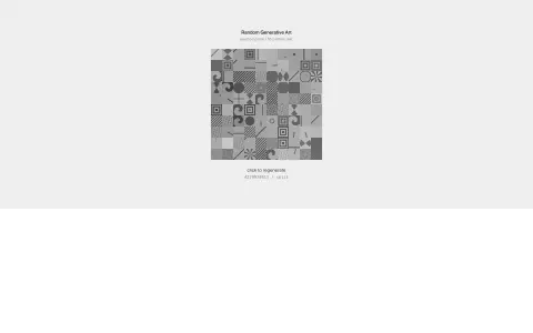
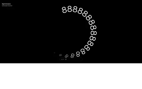
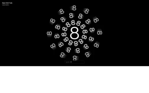
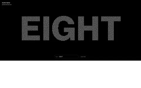
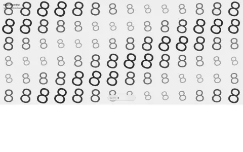










The catalogue is the proof.
113 components went in as JSX, carrying whatever colours and stock photographs their packs shipped with. 113 came out in grey, set in one typeface, showing eight pictures between them. Five still talk back to the console, and the library says which.
Open the live library ↗